Positioning & Design System
This page is the source of truth for the MVP Bistro brand: who we are, who we work for, how we sound and how mvpbistro.ru looks. Use it when creating any brand materials – from landing pages and decks to posts and ad creatives.
1. Positioning
The approved brand direction is "Velocity": speed as the core value, backed by a launch track record and Claude Code expertise.
Full-cycle product studio
MVP Bistro turns an idea into a test-ready digital product: idea packaging, design, development and launch on a production domain.
Weeks, not months
The full cycle in one sprint: 2–4 weeks instead of the 4–6 months a classic team of 3–5 people needs.
One expert with Claude Code
Deep Claude Code expertise lets one person build what used to take a whole team.
Entrepreneurs and companies
Anyone who needs to validate a hypothesis or launch an MVP fast: founders, product leaders, corporate innovators.
Numbers, not promises
6 products launched · 1M+ users · $50M+ in sales. 10+ years of launching and scaling products.
Free intro call
All CTAs lead to messengers (WhatsApp first on the English version): discuss the idea and estimate the launch timeline – no strings attached.
2. Success stories
Six launched products by the founder – the brand's evidence base. Names, roles and achievements are used in materials verbatim.
Spices by MegaFon
- 1M+ users in 1.5 years
- $50M+ of partner sales in 2 years
- Best project of 2018 at the internal MegaLabs award
MegaFon Travel
- 8 services on one platform – from flights to insurance
- Hundreds of thousands of users
- Millions of dollars in sales
MegaFon Health
- 39 medical specialties
- Tens of thousands of users
- Hundreds of thousands of dollars in revenue
Innovation Map
- 6,000 solutions from 4,000 companies for the Moscow City Government
- Hundreds of requests from city customers and dozens of adoptions
- Russia's best innovation-promotion project of 2020
Yoffer
- AI helps polish resumes, match vacancies and prepare for interviews
- Thousands of registered users within a couple of months
- Other metrics under NDA
Office360
- Annual revenue from 0 to $3M+ in 2 years (top 10 in Moscow)
- In-house CRM and ERP systems, 30,000 products in the catalog
- Successful exit; the company is 15 years old
3. Contact details
| Channel | Value |
|---|---|
| WhatsApp (primary CTA on /en/) | wa.me/+79258555366 |
| Telegram | t.me/maxkazankin |
| MAX | max.ru/u/… |
| Phone | +7 925 855-53-66 |
| max@mvpbistro.ru | |
| Legal entity | Sole proprietor Maxim Kazankin · INN 690901526667 · OGRNIP 326480000000310 |
4. Tone of voice
The brand voice is a confident practitioner: short, concrete, numbers first.
Principles
- Specifics over promises: "2–4 weeks", "1M+ users" – not "fast" and "a lot".
- Short simple sentences, active voice, no corporate waffle.
- Respectful and direct; no chumminess, no pathos.
- Professional terms (Discovery, JTBD, CI/CD) are not spelled out – the audience knows them.
Copy rules
- Dash – short en dash "–" only; the em dash "—" is not used.
- Numbers with grouped digits: "6,000 solutions", "$50M+".
- Ranges with "–" and no spaces: 2–4 weeks, 3–5 people.
- Section names are nouns without verbal calls; CTAs are verbs ("Discuss your idea", "See the cases").
5. Logo
The "Idea → Product" mark: a dot (idea) → an outline (prototype) → a filled square (finished product). The wordmark is set in Sora: "MVP" – 700, "Bistro" – 400.

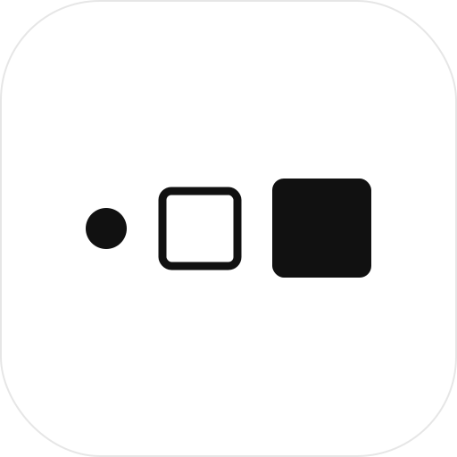
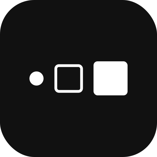
Files: /assets/logo/ – logo-horizontal / logo-horizontal-en (PNG), logo-square (SVG), favicon-white and favicon-black (SVG/PNG). The site header uses the PNG version: SVG with live text is unpredictable without the loaded font. Minimum height of the horizontal logo – 18px; clear space – the height of the "dot" mark on all sides.
6. Colors
A black-and-white base with a single indigo accent. The accent is used sparingly: CTAs, links, figures, labels – not for filling large surfaces (the "How to start" section is the exception).
| Role | Value | Token |
|---|---|---|
| Muted text (leads) | #555555 | --muted-1 |
| Descriptions | #666666 / #777777 | --muted-2 / --muted-3 |
| Figure captions | #888888 | --muted-4 |
| Page frame | #E2E2DC | --border-outer |
| Card borders | #EEEEEE / #F0F0EC | --border-inner / --border-inner-2 |
| Role list rows | #E6E6E2 | --border-row |
7. Typography
Two typefaces: Sora (headings and text) and Space Mono (labels and figures only: eyebrows, counters, legal lines – not for multi-line copy). Sora weights 400–800, Space Mono 400/700, Google Fonts. Sizes are set in rem: the 16px root grows to 20px across 1300→1900px viewports (+25% at 1920) and compresses to ~14px at 1000px, so the whole layout scales fluidly. Mobile keeps a 16px base.
| Role | Font | 1000 | 1300 | 1440 | 1680 | 1920+ |
|---|---|---|---|---|---|---|
| Display / H1 hero | Sora 800 | 52 (5.2vw) | 66 | 70 | 76 | 82 |
| Section H2 | Sora 800 | 35 | 40 | 42 | 46 | 50 |
| Hero metric | Sora 800 | 33 | 38 | 40 | 44 | 48 |
| Case title | Sora 700 | 23 | 26 | 28 | 30 | 33 |
| Competency title | Sora 700 | 18 | 20 | 21 | 23 | 25 |
| Hero lead | Sora 400 | 18 | 20 | 21 | 23 | 25 |
| Section subtitle | Sora 400 | 15 | 17 | 18 | 20 | 21 |
| Card body (cases) | Sora 400 | 14 | 16 | 17 | 19 | 20 |
| Competency description | Sora 400 | 12 | 14 | 15 | 16 | 17.5 |
| Menu, buttons | Sora 500–600 | 13–14 | 15–16 | 16–17 | 17–19 | 19–20 |
| Eyebrow / counters | Space Mono 400 | 11 | 13 | 14 | 15 | 16 |
8. Grid & geometry
| Parameter | Value |
|---|---|
| Container | max-width 80rem (1280px at base scale); on desktop – a fixed rounded "frame" inset from the window edges, content scrolls inside it screen by screen |
| Header height | 5rem (--nav-h); sticky on mobile |
| Section side padding | 44px (mobile 20px) |
| Radii | page frame 14px · case cards 16px · competency cards 12px · buttons 8–12px · badges 999px |
| Frame shadow | 0 30px 80px -50px rgba(0,0,0,0.5) |
| Section order | Hero → Cases (dark) → Competencies (white, grey cards) → Claude Code (grey) → Expert → Contacts |
| Desktop scrolling | native CSS scroll snap: the browser glides and settles on each screen (wheel/trackpad); PageUp/Down and ↑/↓ page smoothly; ←/→ drive the case slider on its slide; dot navigation on the right with tooltips |
9. Components
Live examples – the same classes as on the landing page.
.btn--dark · .btn--outline · .btn--accent.btn--sm
.btn--white · .btn--outline-invert
.badge – Space Mono 11px, uppercase, --accent-tint background
.comp-card: --bg-soft background, 1px --border-inner-2 border, 12px radius
.speed__bar: 26px tall, 6px radius; slow – 100% #DFDFD9, fast – 22% --accent
Three bars of decreasing length: accent → ink → accent-tint; hidden on mobile
Privacy policy
Русская версия – mvpbistro.ru/company-profile